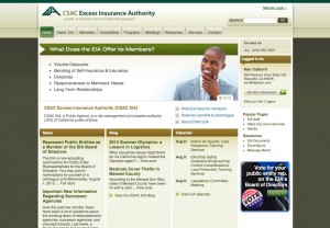
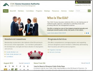
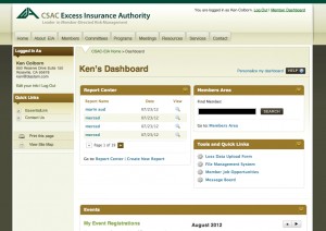
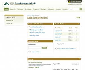
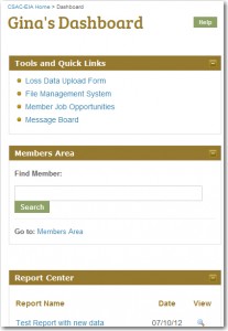
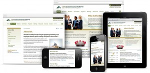
 To continually improve your experience on the EIA website, we worked with our online marketing company to redesign the website and utilize a new method of web design called responsive design, which makes the site easily viewed on mobile devices. The site now automatically resizes to the size of the device you are using, making it easier to use away from your desktop.
Key improvements:
- Cleaner, more visually appealing web design
- Larger font and enhanced text colors for improved readability
- Easier to find the page you want with a restructured navigation system
- Easy to use on the go—same site experience on desktops and mobile devices
- Improved homepage layout to highlight the information you access the most (based on user data)
- Mobile-accessible Dashboard which maintains functionality on all devices
- Improved blog experience (new design, easy to read on mobile devices)
- Calendar—improved layout
- Message Board/Forum—improved layout
We welcome your feedback, and we hope you enjoy the new design when it launches. These types of projects are part of ongoing efforts to make the site better and better for you, our valued members.
Take a Look!


